These Graphics Help Explain What Climate Change Looked Like in 2024
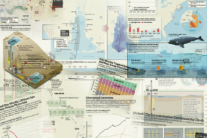
Telling the story of our lives—climate change—takes a lot of words. But sometimes, a graphic is what makes things click. Whoever coined the adage “a picture is worth a thousand words” was likely not referring to a chart, a locator map or an infographic, but in many cases that’s exactly their value to the reader. … Continue reading These Graphics Help Explain What Climate Change Looked Like in 2024