Infographics
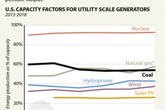
Chart: Coal Use’s Slide in the Power Grid
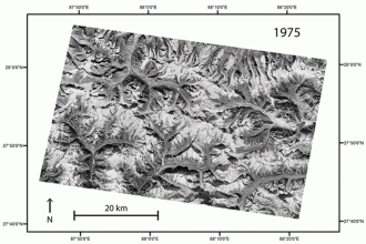
Animation: The Himalayan Region’s Changing Glaciers
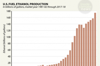
Chart: The Ethanol Boom
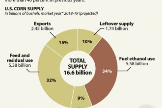
Chart: What Happens to American-Grown Corn?
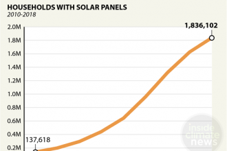
Chart: Rooftop Solar’s U.S. Growth
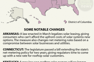
Map: States Rethink Solar Rules
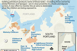
Map: Who’s Breathing the Air Near South Portland’s Petroleum Tank Farms?
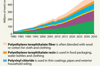
Chart: Plastics Demand Rising
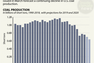
Chart: U.S. Coal Production’s Slide
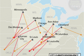
Infographic: The Midwest’s Climate in 60 Years
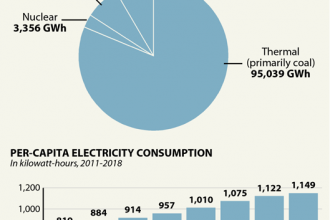
Charts: India’s Electricity Use
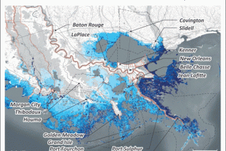
Animation: Louisiana’s Coastal Flood Risk
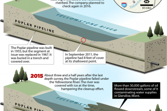
Infographic: How a River Can Undermine an Oil Pipeline
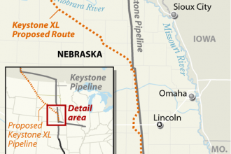
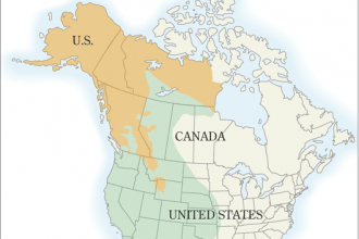
Map: Keystone XL’s Proposed Nebraska Route
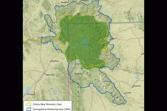
Animation: Grizzly Bears Expand Their Range Around Yellowstone Park
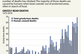
Chart: Grizzly Bear Deaths in the Yellowstone Area