Infographics
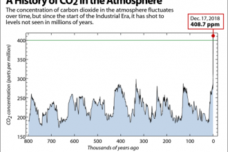
Chart: The Keeling Curve – A History of CO2 in the Atmosphere
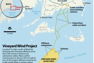
Map: Vineyard Wind Project
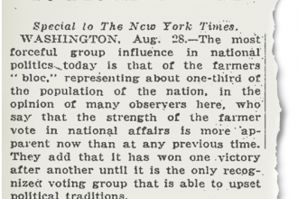
Image: 1921 New York Times Article on the Farm Bureau’s Influence
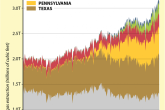
Chart: The Farmland Fracking Boom
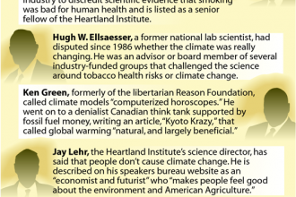
Chart: Climate Contrarians Involved in Key Study on Climate and Farming

Image: GCC’s 1997 Newspaper Ad Opposing the Kyoto Protocol
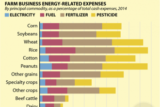
Chart: Fossil Fuel Costs on the Farm
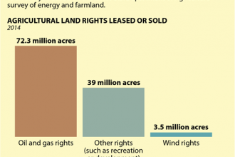
Chart: Some Farmers Also Sell and Lease Rights for Energy Production
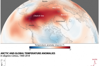
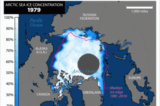
2018: Arctic’s Second-Warmest Year on Record
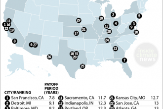
Map: How Fast Do Net-Zero Energy Homes Pay Off? That Depends on Where You Are

Infographic: What Makes a Net-Zero Energy Home so Efficient?
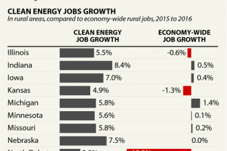
Chart: Clean Energy Jobs Growth Boomed in the Rural Midwest

Chart: Who Has More Jobs? Clean Energy vs. Fossil Fuels in the Midwest
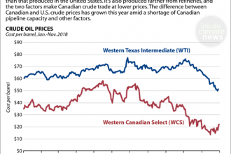
Chart: Falling Prices for Canadian Crude Oil
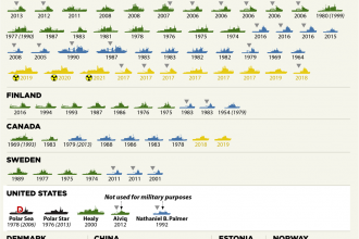
Chart: Icebreaker Fleets Around the World
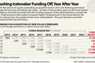
Chart: Pushing Icebreaker Funding Off, Year After Year