Infographics
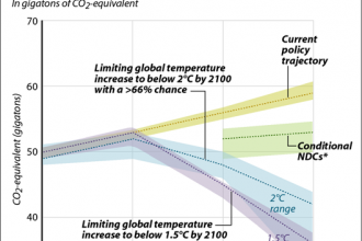
Chart: How Big Is the Global Emissions Gap?
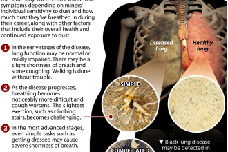
Black Lung Disease: A Primer
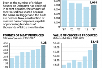
Bigger Barns, Bigger Chickens: Delmarva’s Poultry Industry by the Numbers

Bethel Brock Case Timeline: A 14-Year Battle for Black Lung Benefits
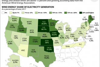
Map: Which States Are Big on Wind Power?
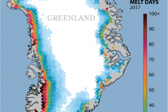
Map: Greenland Melt Days, 2017
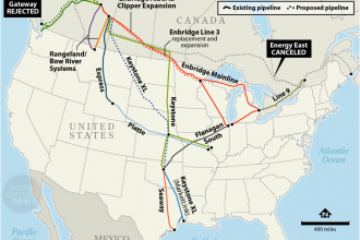
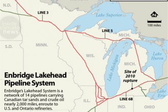
Map: Major Pipelines Carrying Canadian Oil
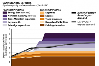
Chart: Pipeline Bottleneck for Tar Sands Exports
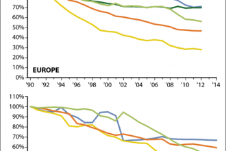
Falling Levels of Key Air Pollutants in Europe and the U.S.
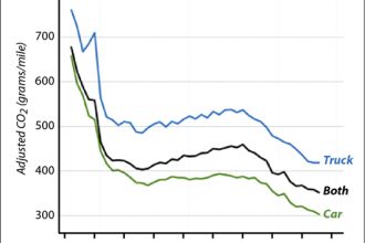
Chart: How Average U.S. Vehicle CO2 Emissions Have Changed
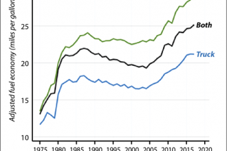
Chart: How Average U.S. Fuel Economy Has Changed
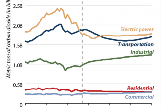
Chart: Energy-Related CO2 Emissions by Sector
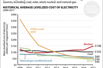
How Energy Prices Compare
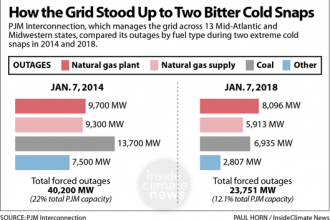
How the Grid Stood Up to Two Bitter Cold Snaps

Natural Catastrophes on the Rise: Global Trends Chart
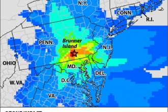
Map: Brunner Island’s Smog Impact